Introduction to Seaborn Library in Python
Data Visualization helps represent the data straightforwardly, making interpretation easier for us. We have seen Matplotlib in our previous blog, and Seaborn can be interpreted as one step higher than Matplotlib. Seaborn is an open-source library built on Matplotlib and works excellently with data frames and pandas libraries. In this session, we will learn data visualization using the Seaborn library stepwise and its advantages over the Matplotlib library.
Key Takeaways from this blog
After going through this blog, we will be able to understand the following things:
- Why Seaborn over Matplotlib?
- Installation of Seaborn library in Python.
- Various Data Plots using Seaborn library.
Let's start with a genuine question if matplotlib is already there, why Seaborn?
Why Seaborn over Matplotlib?
Both Seaborn and Matplolib are capable enough to represent any data. But the difference comes in due to the appealing features of Seaborn. Seaborn makes our plots look attractive and allows some standard data visualization essentials like color mapping and ease in plotting while using a data frame. There are two significant limitations for Matplotlib:
- Matplotlib lacks customized themes and color pallets. In other words, Matplotlib figures are not as appealing as Seaborn plots.
- Matplotlib functions don't work well with data frames, while plotting the same in Seaborn is much easier.
Seaborn brings the difference by solving these problems present in Matplotlib. So let's learn about the installation of this library.
How to Install Seaborn in Python?
Seaborn requires some dependencies before installing it. The dependencies are as follows:
- NumPy
- SciPy
- Matplotlib
- Pandas
We don't need to install them separately; they will be installed automatically if found missing. For installing Seaborn, we need to use the pip command:
pip install seaborn
In a conda environment, the following command will work:
conda install seaborn
Now, we can use seaborn by simply importing it.
import seaborn as snsWe are ready now to explore the true potential of seaborn.
Data Visualization Using Seaborn
For visualization purposes, we will make use of the following datasets:
- IBM HR Attrition Dataset
- Iris Flower Dataset
- Boston House Price Dataset
- Temperature Readings IoT Device Dataset
Further, we will explore the plots based on the data type. We have different plots for continuous, categorical, and mixed variables. In this session, we will cover the following plots using the Seaborn library, their syntax, and when you should use which plot:
- Scatter Plot
- Pie Chart
- Histograms
- Box Plot
- Violin Plot
- Pair Plot
- Correlation Heatmap
- Joint Plot
- Ridge Plot
Let's start one by one:
Scatter Plot
Scatter plots are used to reveal the statistical relationship between two different variables. Scatter plots are generally used when both the variables in the analysis are continuous.
# Syntax for Scatter Plot:
seaborn.scatterplot(*, x=None, y=None, hue=None, style=None,
                    size=None, data=None, palette=None, hue_order=None,
                    hue_norm=None, markers=True, style_order=None,
                    x_bins=None, y_bins=None, ci=95, legend='auto')
Let's implement a scatter plot to visualize the relationship between Age and Monthly Income variables of IBM HR Attrition data:
import pandas as pd
import seaborn as sns
sns.set() # Creates a grid in the plot

attrition = pd.read_csv('Attrition.csv') # Loading Data
sns.scatterplot(x="Age", y="MonthlyIncome", data = attrition)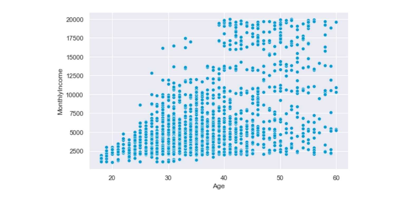
Interpretation: Age and Monthly Income has a positive relation; as age increases, the monthly income also increases.
Pie Chart
The Pie Chart is used to visualize univariate data that describes the data in a circular diagram. Each pie chart slice corresponds to a relative portion of the category against the entire group. This helps compare the shares occupied by each category in a variable at a fixed time. Pie Charts are best suited for categorical univariate features.
The Pie-Chart requires Matplotlib's involvement since Seaborn doesn't have its own independent Pie Chart.
# Syntax for Pie Chart
plt.pie(data, labels=labels, colors = colors, autopct = '%0.0f%%',
        explode = explode, shadow = 'True', startangle = 90,
        wedgeprops = {'linewidth': 6},frame = 'true',
        center = (0.1,0.1), rotatelabels = 'true')
Let's implement Pie Chart to visualize the education fields of various employees working in IBM:
import seaborn as sns
import matplotlib.pyplot as plt
colors = sns.color_palette('pastel')# Defining Color Palette
attrition['EducationField'].value_counts().plot.pie(autopct='%1.1f%%',
                                                    figsize=(8,8), colors=colors)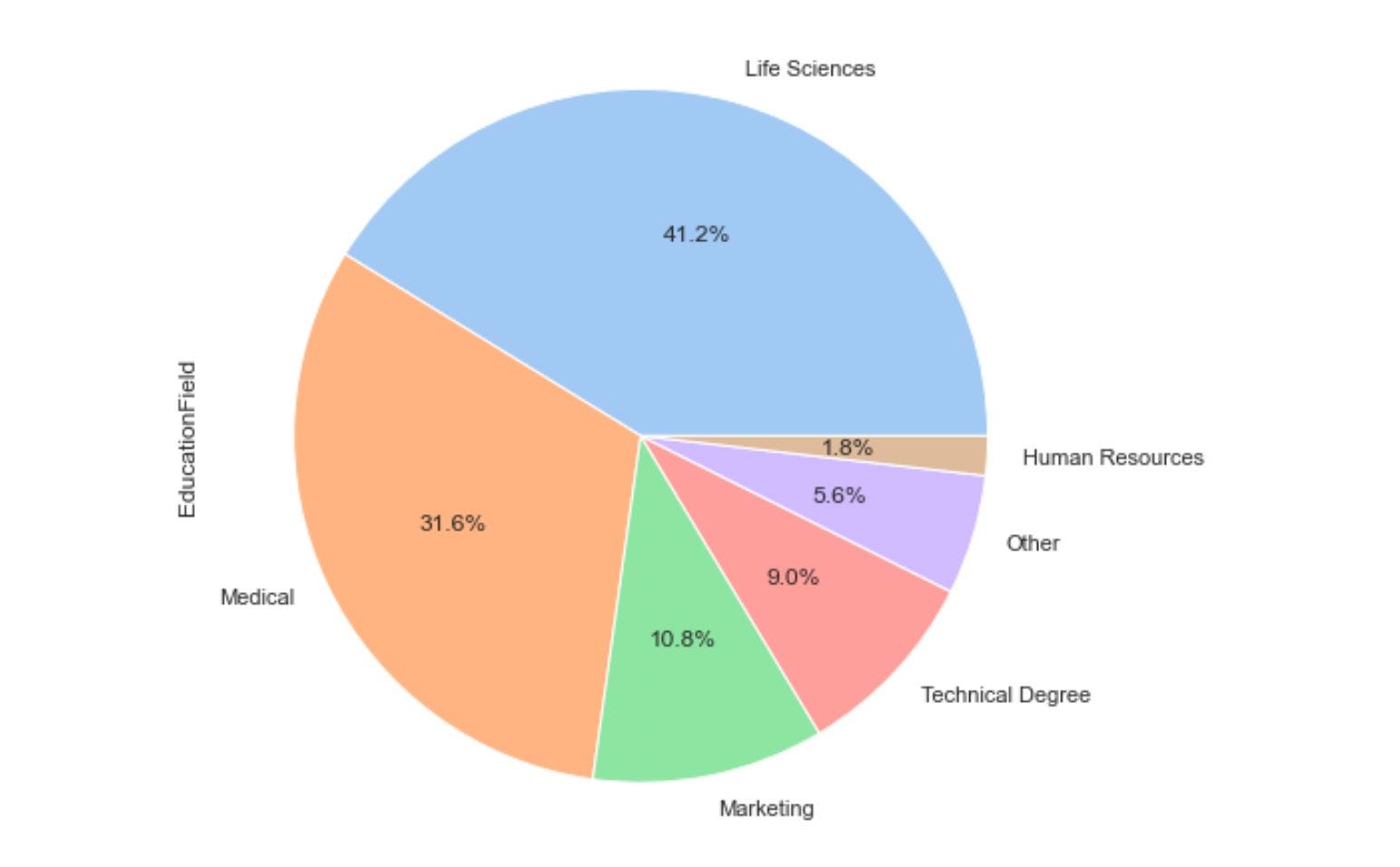
Histograms
Histograms are used for univariate continuous variables to visualize the distribution of the variable as a sequence of bars. Each bar covers an interval of values known as bins. Bins are generated by dividing the overall range into several intervals, and these intervals are known as bins. The height of the bar represents the frequency of values falling into the corresponding interval.
# Syntax for Histograms
seaborn.histplot(data=None, *, x=None, y=None, hue=None,
                 weights=None, stat='count', bins='auto',
                 binwidth=None, binrange=None, cumulative=False,
                 common_bins=True, multiple='layer', element='bars',
                 fill=True, kde=False, palette=None, color=None,
                 log_scale=None, legend=True, ax=None)
Let's plot the distribution of age of all employees working and moving out of IBM using the histplot function in Seaborn:
from matplotlib import pyplot as plt
import seaborn as sns
sns.set()# Creates Grid

plt.figure(figsize=(10,6))# Customize the size of plot
ax=sns.histplot(data=attrition, x="Age", hue='Attrition', kde= True)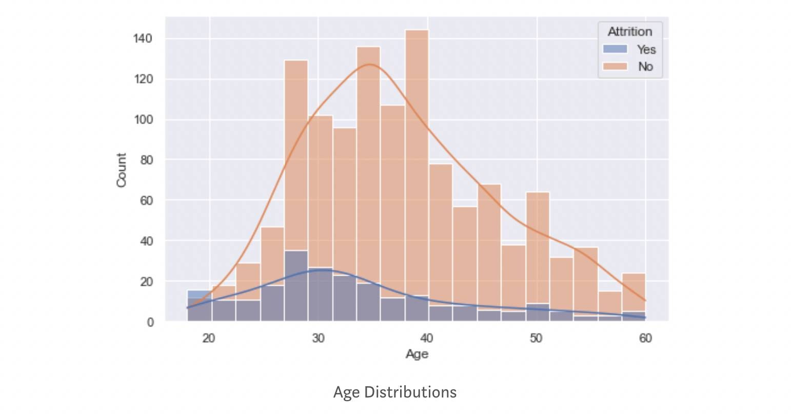
The orange distribution represents employees still working at IBM, whereas the dark blue represents those employees who are moving out of IBM. The average age of employees moving out is smaller than those still working in IBM.
The 'hue' parameter separates and maps the distribution based on category. At the same time, the 'KDE' parameter is a bool that helps in the computation of kernel density estimate that helps in smoothing the curve. If you are curious about how KDE works, visit this link.
Box Plot
A Box plot is a diagram often used for visualizing the distribution of a continuous numeric variable. A box plot divides data into equal parts using the three quartiles, which helps study the distribution. A quartile is a statistical term used for defining the division of observations. If you want to know more about box plots, then please follow this blog.
# Syntax for Box Plot
seaborn.boxplot(*, x=None, y=None, hue=None, data=None,
                order=None, orient=None, color=None,
                palette=None, saturation=0.75, width=0.8,
                dodge=True, fliersize=5, linewidth=None,
                whis=1.5, ax=None, **kwargs)
Let's plot the distribution of age using the boxplot:
import seaborn as sns
sns.set_theme()
ax = sns.boxplot(x=attrition["Age"], color='#009ACD')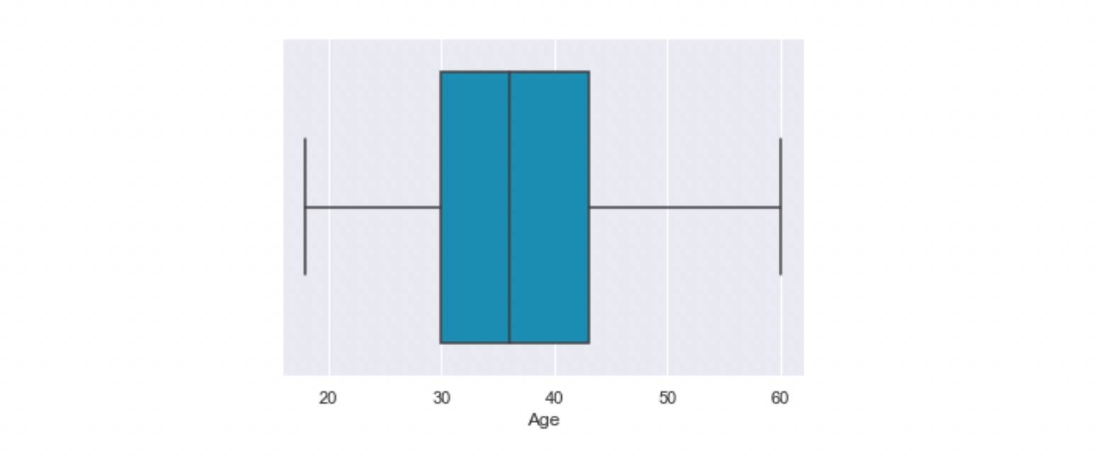
We can also use boxplots for more complex visualizations. Let's have another illustration where we are interested in the age distribution of employees of different job roles. We also want to compare the age distribution of "already-left" vs. "stayed" employees.
import seaborn as sns
import matplotlib.pyplot as plt
sns.set()

plt.figure(figsize=(10,6))
ax = sns.boxplot(x="JobRole", y="Age", hue="Attrition", data=attrition, palette="Set3")
ax.tick_params(axis='x', rotation=30)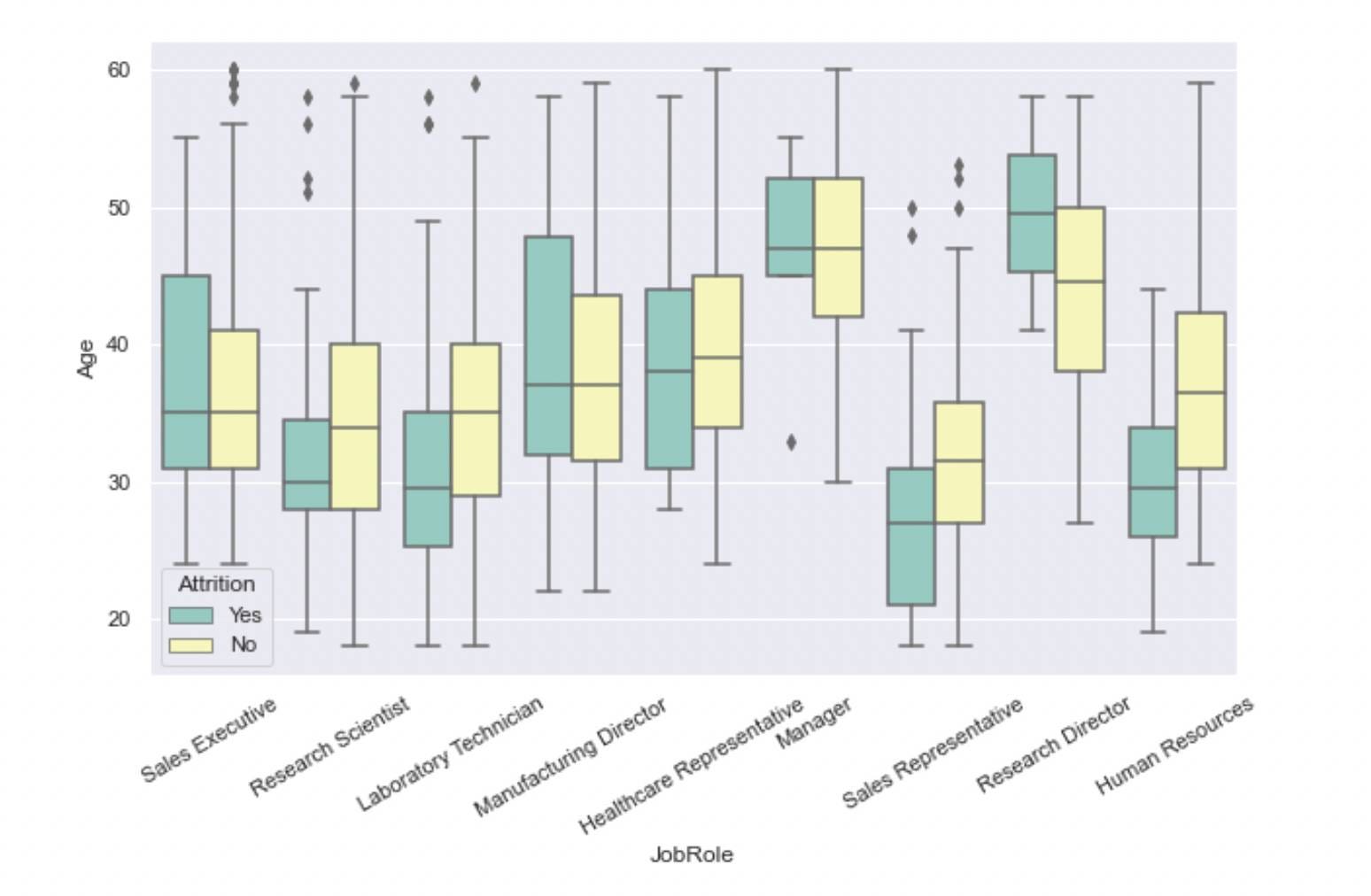
Boxplots can be used for univariate and bivariate analysis. In the above example, we used a continuous and a categorical variable.
Violin Plot
The Violin plot is an extension of the boxplot. Box-plot only provides summary statistics like IQR, Median, 1st, and 2nd quartiles. Violin provides the same along with the Kernel Density Estimation(KDE) data. Hence, using a Violin plot is preferable to the boxplot.
# Syntax for Violin Plot
seaborn.violinplot(*, x=None, y=None, hue=None, data=None,
                   order=None, hue_order=None, bw='scott',
                   cut=2, scale='area', gridsize=100, width=0.8,
                   inner='box', split=False, orient=None,
                   linewidth=None, color=None, palette=None,
                   saturation=0.75, ax=None, **kwargs)
Let's find out the age distribution for different job roles.
import seaborn as sns
import matplotlib.pyplot as plt
sns.set()

plt.figure(figsize=(13,6))
ax = sns.violinplot(x="JobRole", y="Age", data=attrition, palette="Set3")
ax.tick_params(axis='x', rotation=30)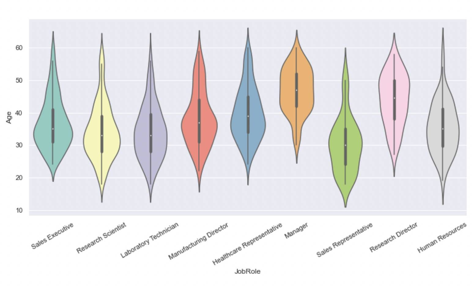
Like boxplots, violin plots can be used for univariate and bivariate analysis. We used a continuous and a categorical variable in the above example.
Pair plot
A pair plot helps visualize the pairwise relationship of variables by plotting the pairwise scatter plots and KDE distributions. This plot is helpful when variables are numeric and less in number. As the number of variables increases, the complexity of the plot also increases.
# Syntax for Pairplot
seaborn.pairplot(data, *, hue=None, hue_order=None,
                 palette=None, vars=None, x_vars=None,
                 y_vars=None, kind='scatter',
                 diag_kind='auto', markers=None, height=2.5,
                 aspect=1, corner=False, dropna=False,
                 plot_kws=None, diag_kws=None, grid_kws=None, size=None)
Let's implement it over the Iris Dataset to see how flower features relate.
import pandas as pd
import seaborn as sns
from sklearn.datasets import load_iris
data = load_iris()

df = pd.DataFrame(data.data, columns=data.feature_names)
df["species"] = data.target
sns.pairplot(df, hue="species", markers=["o", "s", "D"], palette='Set2')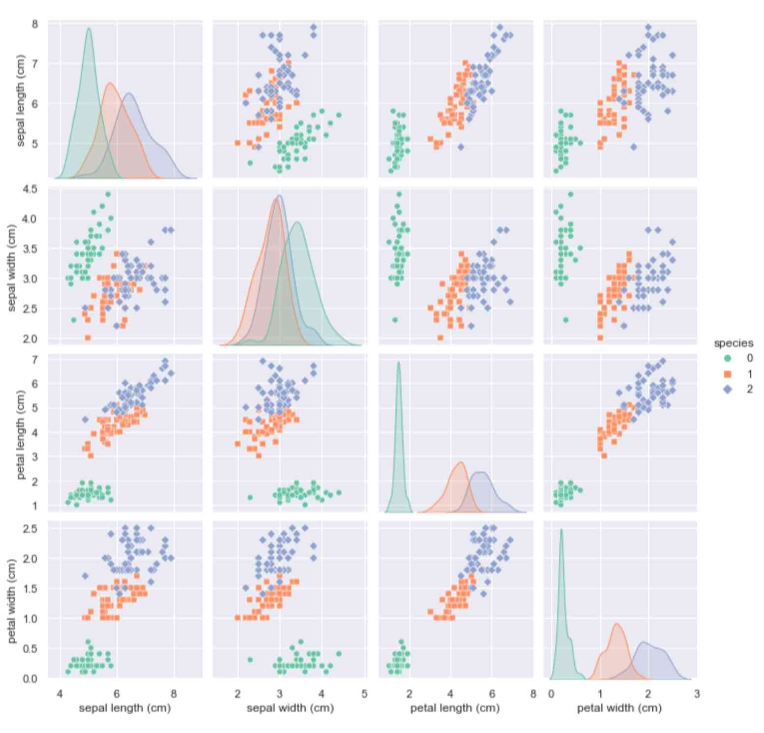
A pair plot is proper when variables in the investigation are continuous.
Correlation Heatmap
A correlation heatmap is a visual representation of a regular correlation matrix. It helps in representing the correlation between different variables. The correlation value varies between -1 to 1. A negative correlation indicates an inverse relationship; a positive correlation indicates a linear relation, and a correlation of near-zero value indicates no relationship.
Correlation heatmaps are only valid for numeric datasets.
# Syntax for Correlation Heatmap
seaborn.heatmap(data, *, vmin=None, vmax=None, cmap=None,
                center=None, robust=False, annot=None, fmt='.2g',
                annot_kws=None, linewidths=0, linecolor='white',
                cbar=True, cbar_kws=None, cbar_ax=None,
                square=False, xticklabels='auto',
                yticklabels='auto', mask=None, ax=None, **kwargs)
Let's implement a heatmap in IBM Attrition Dataset. Some features have an object data type; we need to convert them to numeric first, and then we can implement a heatmap.
# Converting the datatype

for col in employee_attrition_data.columns:

   if employee_attrition_data[col].dtype == 'object':
      employee_attrition_data[col]= employee_attrition_data[col].astype('category')
      employee_attrition_data[col] = employee_attrition_data[col].cat.codes

sns.set_theme(context='notebook', style='darkgrid', palette='winter', font='sans-serif', font_scale=1, color_codes=True, rc=None)
plt.figure(figsize=(15,9))
cmap = "PuBuGn"
sns.heatmap(employee_attrition_data.corr(), cmap =cmap, center=0, annot=False, square=True);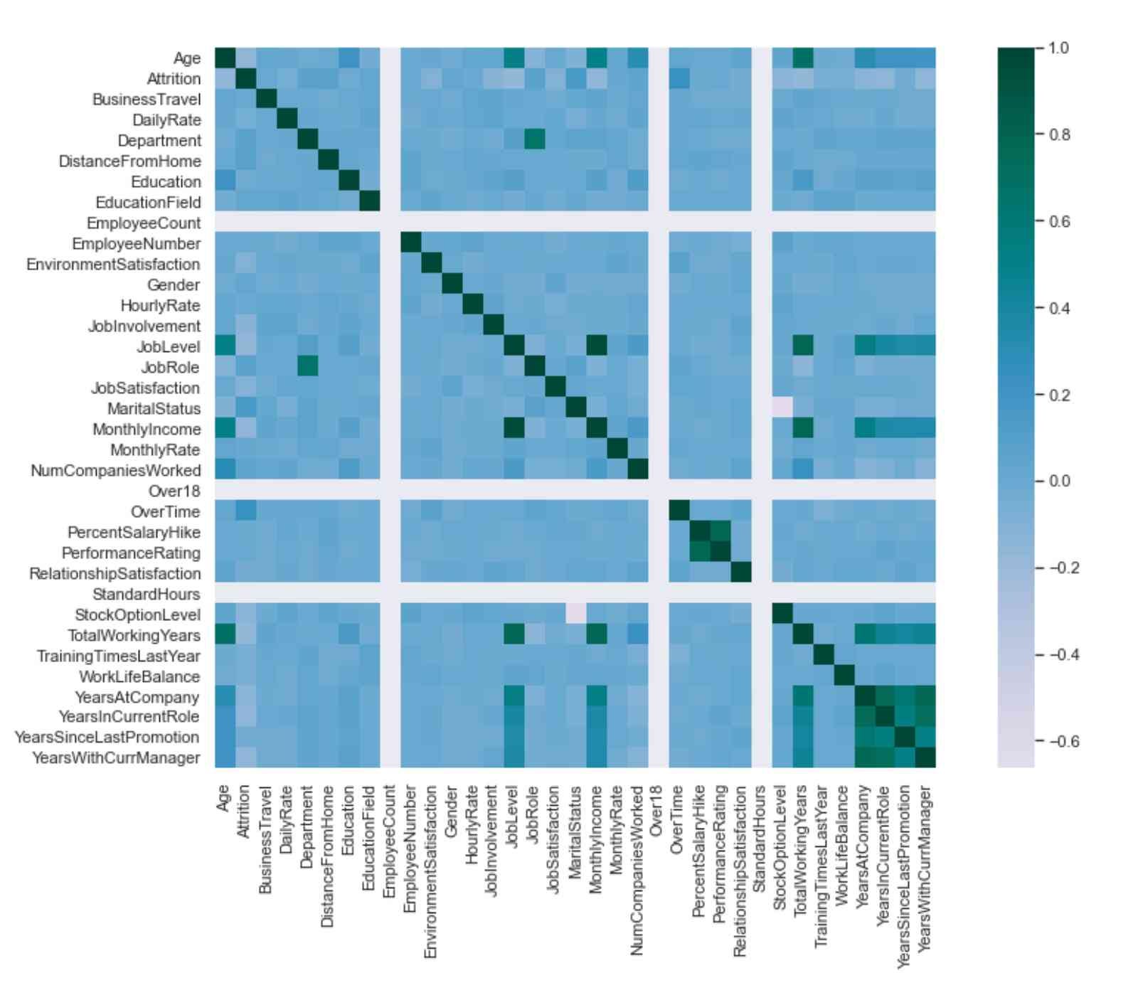
Joint Plot
Joint plots are used for bivariate analysis where the two variables under investigation are always continuous. The joint plot consists of three plots; One plot displays the statistical relationship between the two variables, the same as a scatter plot. The other two plots show the distribution of X and Y variables.
# Syntax of Joint Plot
seaborn.jointplot(*, x=None, y=None, data=None, kind='scatter',
                  color=None, height=6, ratio=5, space=0.2,
                  dropna=False, xlim=None, ylim=None,
                  marginal_ticks=False, joint_kws=None,
                  marginal_kws=None, hue=None, palette=None,
                  hue_order=None, hue_norm=None, **kwargs)
Let's implement Joint Plot to determine the relationship between the house's median price and age. We will be using the Boston house price dataset for this illustration.
import pandas as pd
import seaborn as sns
sns.set()

housing_data = pd.read_csv('boston.csv')# Loading House Price Data
sns.jointplot(x="AGE", y="MEDV", data=housing_data, height= 7, color="#009ACD")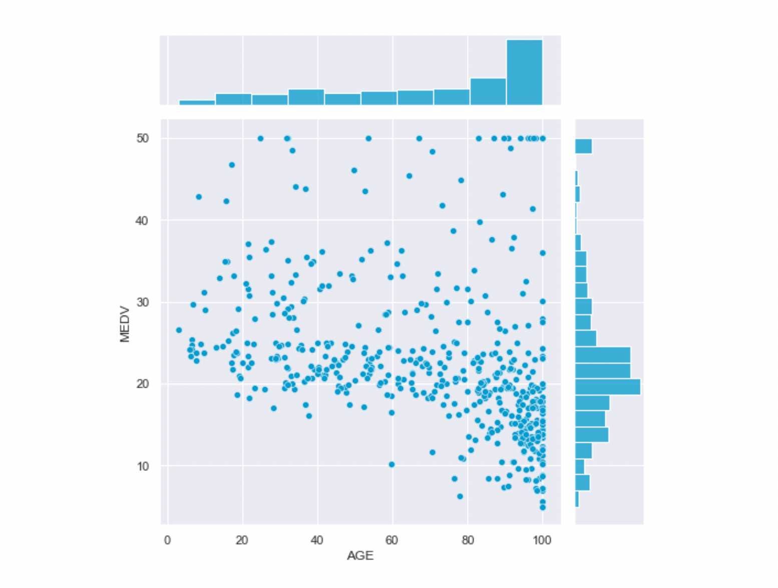
From the above plot, we can conclude that the house price and age relationship is negative as the house's age increases and the median house price decreases. Also, the most common median house price ranges between 25 to 15 Million USD, and most houses are century-old.
Ridge Plot
Ridge or Ridgeline plots are stacked mountain-like distributions. They are very effective while visualizing the change in distribution over time or space. This plot can also be used to visualize the distribution of certain continuous variables over some categorical variables.
'''The syntax for Ridge Plot is not straight-forward as it requires two steps:
1. Defining the grid using seaborn's FacetGrid
Syntax for FacetGrid '''

seaborn.facetgrid(self, data, *, row=None, col=None, hue=None,
                  col_wrap=None, sharex=True, sharey=True,
                  height=3, aspect=1, palette=None, row_order=None,
                  col_order=None, hue_order=None, hue_kws=None,
                  dropna=False, legend_out=True)

# 2. Defining the KDE Distribution using seaborn's kdeplot
seaborn.kdeplot(x=None, *, y=None, shade=None, vertical=False,
                kernel=None, bw=None, gridsize=200, cut=3,
                clip=None, legend=True, cumulative=False, shade_lowest=None,
                cbar=False, cbar_ax=None, cbar_kws=None, ax=None,
                weights=None, hue=None, palette=None, hue_order=None,
                hue_norm=None)
Let's implement the Ridgeline Plot for finding the shift in temperature pattern. For this, we will make use of Temperature Readings: IoT Devices dataset:
import calendar
import seaborn as sns
import pandas as pd

temperature_data = pd.read_csv('IOT-temp.csv')
temperature_data = temperature_data[["noted_date", "temp", "out/in"]]
temperature_data=temperature_data[temperature_data["out/in"]=="Out"]
temperature_data["noted_date"]=pd.to_datetime(temperature_data["noted_date"])
temperature_data["month"] = temperature_data["noted_date"].dt.month
temperature_data = temperature_data.sort_values('month')
temperature_data['month'] = temperature_data['month'].apply(lambda x: calendar.month_abbr[x])
temperature_data.drop(["noted_date", "out/in"], axis=1, inplace=True)

# Initialize the FacetGrid object
pal = sns.cubehelix_palette(12, rot=-.25, light=.7)
g = sns.FacetGrid(temperature_data, row="month", hue="month", aspect=15, height=.5, palette=pal)

# Draw the densities in a few steps
g.map(sns.kdeplot, "temp",
      bw_adjust=.5, clip_on=False,
      fill=True, alpha=1, linewidth=1.5)
g.map(sns.kdeplot, "temp", clip_on=False, color="w", lw=2, bw_adjust=.5)

# Define and use a simple function to label the plot in axes coordinates
def label(x, color, label):
    ax = plt.gca()
    ax.text(0, .2, label, fontweight="bold", color=color,
            ha="left", va="center", transform=ax.transAxes)
g.map(label, "temp")

# Set the subplots to overlap
# Remove axes details that don't play well with overlap
g.set_titles("")
g.set(yticks=[], ylabel="")
g.despine(bottom=True, left=True)
g.tight_layout()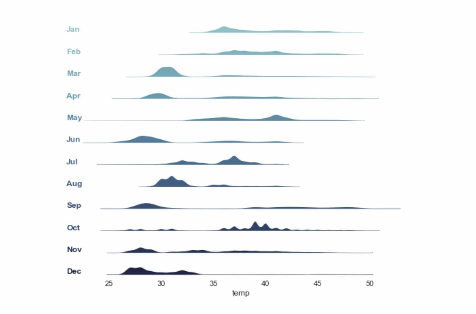
Such plots make the temporal analysis easy to understand, especially for time series analysis. Ridge plots require a continuous and categorical variable.
Conclusion
Here, we briefly introduced the Seaborn library and mentioned its advantages over the Matplotlib Library. We learned about the basic data visualization plots using Seaborn and their syntax and implemented them on real datasets. Further, we knew when to apply which plot based on the data type. We hope you enjoyed the article.
Enjoy Learning!
Share Your Insights
More from EnjoyAlgorithms
Self-paced Courses and Blogs
Coding Interview
OOP Concepts
Our Newsletter
Subscribe to get well designed content on data structure and algorithms, machine learning, system design, object orientd programming and math.
©2023 Code Algorithms Pvt. Ltd.
All rights reserved.
